Saturday, September 30, 2006

Tales From Ward K. III -- When Will The Old-Timers Retire? (circa 1978)

Another chunk of the Ward interview from the Spring of '78. Ward left the studio in 1973, after a weird dispute with then-chairman Card Walker over a granite portrait of Walt Disney displayed on the first floor of the old Animation Building. Ward thought it was ugly (he was right) and said so in a memo.

Apparently, Card Walker didn't take kindly to Mr. Kimball's criticism of Walt's stone portrait. And soon after, Ward departed the studio. Left unfinished was a half-hour featurette starring an animated dog named "Bingo," voiced by Stan Freberg (a project I'm told Mr. Walker also didn't like.) ...

Ollie Johnston, Frank Thomas and Ward Kimball (photo by Dave Mastanreh)

Ward Kimball: ...I don't know why all the animators are getting all the press now. Our comedy and what we did was...everybody thinks it's so great now. It was a result of Disney being there and furnishing the great ideas which made the place go up and we're now cashing in on this.

How long will Woolie keep working there?

Hulett: Maybe another five years...

Ward Kimball: Why did Frank and Ollie retire?

Hulett: They got tired of going to all of Woolie's damn meetings. (Hulett -- 28 years later -- I was more than a little wrong here. Frank and Ollie retired mostly because they had a book, "The Illusion of Life," that they wanted to write.)

Ward Kimball: Well, all you had to do, I used to tell them, you guys are crazy. How long have you been here? Since 1934 or 1935? And you put up with this sh*t? I said, "Why don't you guys speak up?" Ollie and Frank, if they got bored with a meeting, of COURSE they should have left. Milt Kahl used to do this: "Well, I've had enough of his sh*t!" and walk out.

Has Ken Anderson retired yet?

Hulett: Yes. (Ken had hung it up a couple of months before this interview. Apparently Ward hadn't gotten the memo.)

Ward Kimball: Yeah, Ken was so frustrated because Walt wouldn't accept Ken as any kind of a story man. Walt had that way about him. Once you did something, he wouldn't recast you. He never saw you as anything but an animator or a good story man or a mediocre assistant.

Of course poor Ken, like so many of the artists there, suffered and were second-class citizens when compared with Bill Peet. There was nobody at Disney's who was like Bill Peet, and nobody appreciated him. Peet was the closest thing to Walt we ever had story-wise, just a genius, and yet he's not getting any acclaim at all. He and Woolie, here you got these talented artists with ideas coming in against Woolie's scattered way of handling a situation. I don't think Woolie basically has a story sense, but anyway there was this conflict that built up, and Peet was drinking at the time, and so he says "f*ck it" and walks out.

(Hulett: Bill Peet left Disney's midway through "Jungle Book." Bill had creative differences with Walt, got increasingly frustrated, and decided to go his own way.)

Click here to read entire post

New Negotiations?!

I'm not talking about the Writers Guild's contract talks...or the Screen Actors Guild's. I'm talking about the Animation Guild, the International Alliance of Theatrical and Stage Employes (our mother international), and Disney Feature Animation with its Laboratory of Many Secrets.

You see, WDFA's Secret Lab Contract expires in about a month. (This is the Collective Bargaining Agreement that Disney Feature Animation has for all of its CGI work. The pact grew out of a division the Mouse House that was formed in '99...and semi-died three years ago.)

Finally, after many false starts, it appears that negotiations will take place at the IA's West Coast offices in Toluca Lake...

The dates for talks (and these are set in moist cement) are October 12th and October 13th.

We wanted you to know. We'll report how the talks go after they're completed.
Click here to read entire post

Friday, September 29, 2006

Tales From Ward K (Part II): Woolie Reitherman

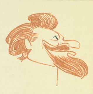
Back in the Spring of '78, Ward Kimball talked to me at length about various Disney animators including my then-boss, Wolfgang Reitherman. When I worked at the Mouse House, one of the rumors was that Ward and Woolie hadn't gotten along too well. If that was the case, it certainly didn't come out in what Mr. Kimball had to say about Woolie ...

Below: Woollie Reitherman, by Larry Eikleberry.
Woollie Reitherman, by Larry Eikleberry
Ward Kimball: Woolie was a good animator, but I think he suffered with a little inferiority complex. He didn't think he was a good artist, even though he was. Basically I think underneath, he compared himself to Fred (Moore) or some of the others, which made him work harder.

But yet, because of this extra drive Woolie had, it reminds me of Pete Rose, the drive Pete had playing baseball. The guy, who is probably older than the others, but he's a student, and wants to be better and consequently he is. Woolie's stuff in "The Rite of Spring" in Fantasia [the battle of the dinosaurs] has a great monumental weight to it, because Woolie in his own way just kept after it.

Woolie was tenacious. He didn't have the quick facility or facile way of working as Fred Moore had (for instance), or the flamboyant, spontaneous timing of Norm Ferguson. And he had to work harder, but he ended up with good stuff. He did good stuff on Jiminy Cricket, for instance. The cricket jumping along pointing to the words of the Blue Fairy's letter with his cane, that's Woolie.

And of course, "How to Ride a Horse" (Goofy short) is a funny picture, one of the funniest shorts. As a shortism blockbuster, I know people who saw "How to Ride a Horse" in the theatre when it was released by itself ten or fifteen times. They would go just to see that and they would laugh and laugh 'til they cried.

Woolie was the Goof man after features he worked on. He was older than the rest of us, so I guess that's why he was put in as the director. (As an animator) he was always stuck with the chase stuff because most people hated to do that, but Woolie got a big kick out of doing fast, action, wild-out stuff and he did it well.

Another guy who did this kind of stuff and did it well was Bill Roberts, an old guy that was animating at the studio when I got there, and finally retired in La Crescenta. Roberts did a lot of great stuff on "Mickey's Polo Team." It's hard to do a crowd of guys, caricatures of famous Hollywood actors, all riding horses as a group. Roberts had that tenacious, almost crude but effective way of pursuing wild action material.

Woolie told me in the 'seventies that he was a "straight ahead" type animator, and liked to plow right through, get the action, go back and refine it. He generally didn't animate from pose to pose to pose. Frank Thomas told me that Woolie would animate "just shapes. You'd look at his early animation tests and couldn't tell what they were. But Woolie knew where he was going. He'd look at the test, see things he liked, and go back and rework the animation until he got what he wanted."

Frank, the story goes, didn't like the chase stuff Woolie did with Captain Hook in Peter Pan -- thought it was too wild and broad. Frank had a lot of Hook's dialogue, so the story maybe fits. I think Wolfgang's treatment of Hook escaping the crocodile at skull rock is wonderful fun. But what do I know? I was just a story guy.

Click here to read entire post

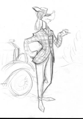
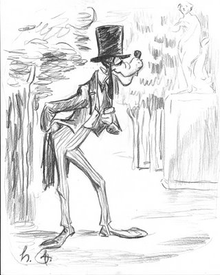
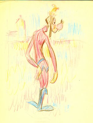
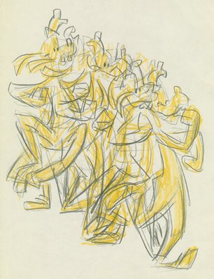
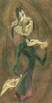
Sparey's Goofy Gallery: Preliminary sketches

We end our docent's tour of le Musée du Goof with some John Sparey sketches that never made it to final Goofy renditions ...

GOOFY TINTYPE

Above: Goofy in the style of a 1910 tintype.

Below: "Old Gufbrandt", Goofy as Rembrandt might have pictured him.

OLD GUFBRANDT

Below: Goofy à la Honoré Daumier.

GUFIER

Below: Toulouse-LaGoof.

TOULOUSE-LAGOOF

And last but certainly not least, Goofy Descending A Staircase (below), the Marcel Duchamp work that was rejected for the Armory Show because ...

DUCHAMP

... as we have delighted in constantly reminding you throughout this tour, Goofy is © Walt Disney Pictures.

Click here to read entire post

SPA tries the waters with Open Season

Sony Pictures Animation takes their first grab at the feature-animation brass ring starting today with Open Season. I saw the film last night, in IMAX 3-D at the ASIFA screening, and I think they've got a winner on their hands....

Now the tricky part: does the movie-going public agree, or are they fatigued by the many CG features already released this year? The film is beautiful, with fantastic character animation and tons of humor, and in most any other year it would be a sure-fire hit. But this is a year where everyone's talking about a glut, and the end of September isn't exactly the choicest release date. From the early reviews over at Rotten Tomatoes, it appears at least some critics have been pretty glutted. We'll see what the public thinks, and update this post through the weekend...

Saturday Addendum: Open Season opened at the top of the chart on Friday with $6.15 million. The Boxoffice Mojo forecast is for the film to make $24 million, which sounds pretty reasonable from the Friday numbers.

Sunday Addendum: SPA's maiden effort took an estimated $23 million for the weekend, handily taking first place. That's a solid put not-quite-spectacular effort, though it does put in in the top ten all-time September openings. Everyone's Hero dropped a huge 76% from last weekend, stumbling to $1.1 million and a $13.2 million total after three weeks.

Click here to read entire post

Thursday, September 28, 2006

Tales From Ward K: Of Rubber Hoses and Fred Moore

What follows is a piece of an interview I did with Ward Kimball long ago in his sunny front yard. He holds forth on a variety of subjects. I roll out a couple of them here ...

Steve Hulett: You mentioned cycle animation in the early days at Disney ...

Ward Kimball: It wasn’t so much cycle animation, because that puts it in the corner of Hanna-Barbera. It still had to have all those nuances and changes. If you had a guy running along, you had to make sure it didn’t look like a cycle to Walt. While the feet may be working as a cycle, maybe the camera is trucking in, or the character is slowly looking around as he’s running. So there wasn’t a cycle.

I remember when I first went to work at Disney, cycle animation was kind of a no-no. If you used a cycle you shouldn’t make your audience aware of it. But you have to realize that when people started to animate, in the old days it was such a difficult process that they looked for simple or almost abstract ways of drawing characters, because the very basic nature of it was multiple drawings which were time-consuming to do. So you invented characters that were on the round side, because everybody knows that it’s faster to do anything if you roll and turn and spiral instead of going in straight lines, or cutting corners, or turning corners.

So your characters became very simple, almost abstract. And when you analyze Mickey Mouse he was two circles connected with two lines, and we had what we call rubber hose animation because Mickey’s and Minnie’s legs both look like black rubber hoses and they acted like sort of a whipping action.

But as we got into more realistic approaches, beginning with the little fairy and the flying mouse…those were the beginnings and you learned how difficult they were. And with Snow White, with the queen they used rotoscope for starters, rotoscoping a villain from a play called “The Drunkard” as sort of inspiration for the witch, but we never did trace them like we did Snow White. There we actually went over [the girl] with rotoscope prints. We changed the head and the proportions ...

So as animation became more of a movie illustration, we got away from that rubber hose arbitrary way of drawing ... The funny thing is, when you look at Winsor McCay’s animation it’s so startlingly real. The thing he did with the mosquito landing on this guy’s forehead was a beautiful drawing of a mosquito, but yet it has sort of a humorous charm about it. Well, he drew exactly like he did his "Little Nemo" strip, which was super illustration, a bit of color like a comic book, but McCay was a realist and didn’t follow the rest of the cartoonists.

The demand [in early animation] was that you had to draw like a comic strip character -- like Felix on the screen -- to be funny. And if you did it realistically you could not be funny. [Early cartoons] were just a series of one gag after another, so in order to make them funny you had to have gross characters done sometimes in an obscene amount of exaggeration. And then we got into more believable stories and plots, like Snow White, and personality development of those seven dwarfs, each one of them different, compared to the early Mickeys where everybody just bounced and played instruments.

SH: Talk about Fred Moore.

WK: Fred deviated from the rubber hose, round circle school. Fred was just right for the time. He was the first one to escape from the rubber hose school. He began getting counter movements, counter thrusts, in the way he drew. More drawing. He decided to make Mickey’s cheeks move with his mouth, which had never been done before when you drew everything inside that circle. He squashed and stretched him more.

And this was right at the time, but Fred was a high school-trained animator. He never went to art school, and he more or less emerged drawing that way. Nobody seems to remember any development. It just came there and started, but the interesting thing is he never went beyond that part. The rest of us came into that place. It was a strange place, we adapted to it and we kept trying to improve and change, and we became students of it. Milt Kahl, myself, Frank and Ollie. We knew it was a tough art, and there were many nuances of techniques and conceptions regarding the way you drew, and the thing we saw was that there were millions of things of things to be learned yet and to try.

Fred never thought of that. He wasn’t a student of animation, he was just a naturally gifted animator whose style and development was perfect, timing-wise, for that point of time of where the studio wanted to go. And when the studio kept going in that direction it became the students, the guys I named, who carried it on. And Fred, being the type of character he was, almost juvenile in a way, was not able to cope with this. He took to drinking instead of saying “Gee, this is interesting. I’ll sit down and explore it too, and improve and rise above what I’ve done.”

The idea was to try to do better than you did the year before, because it was such an open thing. We were pioneering techniques in animation styles that had never been done before. But Fred was content to stay at this one level, and he got all his adulation for The Three Pigs. Pigs isn’t bad. It’s wonderful for the time. It made everything that came before look very crude, and it gave the studio the shot in the arm that Walt thought was wonderful.

So Fred was the man of the hour and couldn’t handle it, really, if you want to know. He just expected to be the man of the hour forever, and then we began to notice that as we got more into the subtleties of animation, slowing in and out, and the little nuances which were not banging and jumping around all the time, Fred’s work began to look crude.

Now that’s a hell of a thing to say, but I’m talking relatively speaking. I noticed it on The Reluctant Dragon. Fred was given the knight with the little boy, and what had been the acceptable way on The Three Little Pigs and in some cases Snow White and the Seven Dwarfs, there were parts, even though they were drawn well, that were crude, timing-wise.

Fred would hit a pose and just freeze there and while we were already loosening those things up and putting in the subtle things that would keep [the animation] alive a long time. That’s what I meant, that at that time Fred was drinking heavily, and I was secretly going in with his exposure sheets and adding these other little drawings that would make them work with the rest of the animation that was being done on the picture.

And more and more, Fred became defensive, and hitting the bottle and feeling sorry for himself. He’d come back from lunch and would want to talk about it, and of course we didn’t want to talk about it. And he wanted to talk about it every afternoon, how the place was giving him a bad deal, and all that, and Walt wasn’t good to him any more.

We just felt sorry for him. We didn’t know what to do and all of a sudden ... you know his brother and father, they had the same drinking problem. We didn’t know that. We’d all go out and have a martini, and with Fred it would become an obsession. And it became an escape when he couldn’t handle the situation in the studio.
Click here to read entire post

We're back!

Starting sometime Wednesday evening, anyone trying to bring up the TAG Blog at http://animationguildblog.blogspot.com got an error message. We just got put back online after well over twelve hours -- far and away the longest blackout since we started the TAG Blog in February.

We were able to log in to the "dashboard" -- the area where we post messages and do maintenance -- so we knew the blog hadn't vanished into the ether. But we still have no word from the blogger.com people as to what happened or if we can expect it to happen again.

So, cross your fingers ...

Click here to read entire post

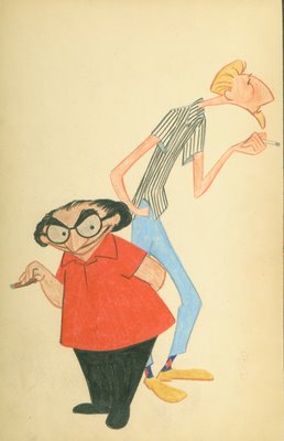
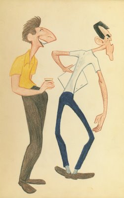
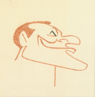
Types I have known, by John Sparey: Wes and Gary

Two of John Sparey's favorite caricature subjects, previously seen here, here and here in our portfolio of John Sparey's artwork ... Wes Herschensohn and Gary Mooney ... Wes Herschensohn and Gary Mooney. Click here to read entire post

Wednesday, September 27, 2006

Animation Artists and Financial Planning

As our last post on saving for retirement, here's a brief report on The Animation Guild's financial panel at last night's membership meeting, and the wisdom they dispensed to TAG members ...

The panel's moderator, E-Board member and trustee Stephan Zupkas, began things with a disclaimer that the Guild was not recommending any of the panelists, or endorsing any of their advice or strategies.

The three panelists, financial advisor Janet Gibson (818-239-3847), CPA and registered Personal Financial Specialist Ralph Bovitz (818-715-0819), and financial advisor/broker Shawn Loddy (619-384-3068), emphasized that their clients need to figure out what they spend (many don't have much of an idea) and develop a blueprint for budgeting, investing, and saving for the proverbial rainy day.

It was clear from members' questions that many in the Animation Guild struggle with bills, credit cards, and putting something away for their gray-haired years.

Bovitz explained that financial planning is simply doing "what it takes to make somebody independent." To do that, people have to be aware of the mistakes they're making; financial planners are good for helping individuals avoid major pitfalls.

Gibson said that her typical animation client is on his third job in two years and had credit card debt and minimal savings. She said that her first order of business is to "get her arms around" the state of a new client's finances and get him or her to chart what they spend for food, drink, and various extras over a week's time. Many, she said, are surprised how all those frappucinos from Starbucks quickly add up to real money.

Loddy said that he has his clients develop a comprehensive financial plan and have the discipline to invest. He pointed out that the name of the game today is to avoid big credit card debt and beat inflation. To do that, people need to look at both domestic and foreign stocks, since foreign countries were probably going to offer higher prospects for growth than U.S. stocks in coming years, since the United States is "a more mature market."

The three planners had different approaches to investing. Janet Gibson liked managed funds (these usually have higher administrative fees), Ralph Bovitz liked index funds (which have lower costs), and Shawn Loddy preferred to "build his own mutual fund" by putting together a group of stocks from different economic sectors that he knew well. All three like the "buy and hold" approach to investing.

All three admitted that with the hire-layoff cycle of artists and technicians in the animation biz, long-term planning is often tough; and makes it hard to build "a rainy day fund" for periods of unemployment when you don't know how long your job will last. Still, they said, people need to plan, budget, and get a general grip on where the money goes if they want to have a comfortable retirement.

Addendum: Kevin here, piggy backing on Steve's posting. I just wanted to add a few notes about some of the panelist's comments that struck me as being useful. One great quote, to which all agreed, was "You cannot have wealth if you have debt." That was identified as absolutely the first place for everyone to start before worrying about the best investment strategy.

Regarding eliminating debt, none of the panelists thought it was useful getting a consolidation loan if you owe on multiple credit cards. That can hurt your credit score, and it probably won't get you out of debt any faster. A simple strategy is to pay the minimum on the cards you owe the most on, and aggressively pay down the lowest-balance card. Getting that first card paid off will be a useful psychological victory. Then, attack the next smallest-debt card, and so on, till all your revolving credit is paid off.

As to credit cards, Janet Gibson urged people to avoid cards that use "two-cycle billing" in calculating interest payments. Those include MBNA, Capital One, First USA, and Discovery, among others. If you use a credit card regularly, use one that uses "average monthly balance" or "average daily balance" for calculating interest. You'll usually find those kinds of cards from the bigger banks and credit unions.

The point was also made that working class folks need financial planning much more than the wealthy, even though it's usually the wealthy who go in for professional help. As one panelist stated, if you make $300 grand a year and you make a $10,000 investing mistake, so what. But if you make $60,000 a year and you make that same mistake, it hurts.

Shawn Loddy also sang the praises of Roth IRAs (and Individual 401(k)s for those with substantial 1099 income). I won't go into the details, but it might be something to explore with your financial planner.

Finally, Ralph Bovitz emphasized that Social Security frequently has errors in their records regarding how much you have coming to you. Sometimes this is their mistake, and sometimes it's because some of your income wasn't properly reported to them by an employer. So carefully review those annual Social Security statements so you can catch any mistakes (and, frankly, you should be doing the same with you annual Motion Picture Industry Pension Fund statements, too).

Happy investing!
Click here to read entire post

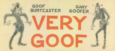
Sparey's Goofy Gallery: The Goof in the movies

A little-known Hollywood fact, according to artist and animator John Sparey, is that Goofy was loaned out to other Hollywood studios, with some interesting results ...
The Goox Bros., by John Sparey

Above: Goofy times three, Marx Bros. style.

Below: Smile when you say that, pardner ... A Goofy take on this movie.

Very Goof, by John Sparey Another in our series of John Sparey's artwork.
Gary, Burt and Groucho notwithstanding, Goofy is © Walt Disney Pictures.
Click here to read entire post

Tuesday, September 26, 2006

Types I have known: Eric and Dick

Two more of John Sparey's fellow Disneyites from the 1950s ...

Eric Cleworth (1920*-1999) and Dick Lucas (1920-1997).

Eric Cleworth and Dick Lucas

Cleworth -- Sparey's boss in the mid-fifties -- started at the Mouse House straight out of high school in 1939, and worked his way up to animator after the war. Eventually, Eric told me, he tired of studio politics and battles with higher-ups, and in 1972, much to the surprise of colleagues, resigned from the studio. He cashed in his stock options (of which he had many), moved to Morro Bay, and lived the comfortable life of a millionaire until his death in 1999.
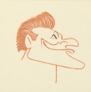
Except for a year or so at H-B in the 1960s, Lucas was also a Disney "lifer", an animator with credits on shorts such as The Truth About Mother Goose, Goliath II and Aquamania, and features from 101 Dalmatians to The Fox and the Hound.

* Cleworth was born on January 3, 1920 in Minneapolis, and not in 1939 as indicated in his IMDb listing. '39 was the year he began his Disney career.
Click here to read entire post

401(k) Plan Fees...and How They Reduce Your Stash

Since we are briefly on the subject of pensions: An ongoing issue with 401(k) Plans is administrative fees. (Hell, it's an ongoing issue with brokers and banks and mutual funds.) The Los Angeles Times has had a couple of articles on the subject in the last few days (see them here and here.) I have a few thoughts on the subject... When I was young, I paid no attention to investment fees of any kind. I had an amiable broker who took me out to breakfast, chatted me up, and charged me 2% of my assets for the privilege. Idiot that I was, I thought that the charge wasn't any big deal. ("Two percent? That isn't very much, is it? I still have, like, 98%..."). Now that I am older and marginally wiser, I find out that 2% is a hell of a lot to take out of assets. Consider: 2% of assets over a ten year span ends up being 20%. Over thirty years? I shudder to think... 401(k) Plans, by their nature, incur expenses. The administrator takes a cut, the plan's legal fees get charged back to the participants, as do a few miscellaneous expenses. We have a plan that is run relatively inexpensively, and we joust with the administrator to cut costs, but it still is higher than various mutual funds (This one, for example, which is the industry low-cost provider.) The average 401(k) Plan has administrative fees running from .4% to 1.5%. The TAG 401(k) Plan has a weighted expense ratio of about eight-tenths of a percent. It's higher from some accounts and lower for others. We strive continually to get it lower. There's no way around incurring expenses as you tuck tax-deferred money away, but you have a right to know what you're paying. But know that these fees are there. Click here to read entire post

The Road to Riches

At tonight's membership meeting, Stephan Zupkas and Steve Hulett will moderate a panel on financial planning for your future and your retirement, with three investment advisors and financial planners as guests... Both Steve and Stephan are keen students of investing, and they've invited several professionals to share their insights and wisdom. Ralph Bovitz, Janet Gibson, and Shawn Loddy will discuss personal financial planning and retirement investing, and answer your financial questions. This will be a great opportunity to get some expensive financial advice for free. We'll serve pizza and soft drinks from 6:30-7:00, with the general membership meeting starting promptly at 7 PM. We'll be doing only the first part of the membership meeting (the minutes of the last meeting and the business agent's report), then go into the panel discussion at 7:20. After the panel discussion, the general membership meeting will conclude. As per recent custom, the meeting will be held at the IATSE Local 44 meeting hall at 12021 Riverside Drive in North Hollywood (just east of Laurel Canyon). Click here to read entire post

Monday, September 25, 2006

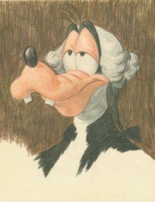
Sparey's Goofy Gallery: The father of our Goofy country

John Sparey was inspired by Gilbert's Stuart's unfinished "Athenaeum postrait" of George Washington ...

Check out more of John Sparey's work on the TAG Blog.

Considering this was the portrait used for the one-dollar bill, it should be no surprise that Goofy is © Walt Disney Pictures.
Click here to read entire post

Democratization of Animated Features?

This comes from the Boston Globe, by way of Kathleen Milnes of the EIDC. Overblown, but it has a few points.
Pixels to the people Animation used to be the province of big studios, but today the techniques are in everyone's hands How to animate a horde of orcs has finally found its way to the little guy. Not so long ago, digital animators had to be members of the big three -- Disney's Pixar division, DreamWorks Animation, and Fox's Blue Sky Studios -- to produce credible feature films. But in just a few short years, the field has been blown wide open ... With the increasing power of computers and availability of sophisticated software, animation techniques such as motion capture and interpolated rotoscoping -- the "painting over film" look seen in this summer's Richard Linklater film, A Scanner Darkly -- make eye-popping visuals significantly more affordable. High-tech animation techniques have spread from CGI-powered studio releases to videos and commercials to shorts on the festival circuit and now to indie features. Even teenagers goofing off with a video camera and processing the footage with off-the-shelf software can produce striking work, says Christopher Perry, assistant professor of media arts and sciences at Hampshire College and graphics software engineer at Pixar. "That's because the skills, the tricks used in big studios, there's a pretty good route the way they trickle down from Hollywood and other places to people who don't [have Hollywood ties]," Perry says. "That's exciting." First-time feature director Christian Volckman made Renaissance, which opens Friday, in a place far from Hollywood: France. At just $18 million, the picture's budget was a pittance compared to mainstream CGI blockbusters -- Cars cost $120 million, and even a middling effort like The Ant Bully set its makers back $50 million. "I was trying something else," Volckman says, describing his all black-and-white, futuristic thriller set in Paris of 2054. The film was made using motion capture, in which the performances of real actors, pinpointed with hundreds of sensors, were videotaped and then digitized. Then, dozens of animators manipulated the images frame by frame. The effect is cold, calculated, and a little eerie, but also visually arresting. "I was thinking about film noir," the French director says. That a newcomer like Volckman, who got his start making music videos and 16mm shorts, can produce such an accomplished work is largely a result of a suddenly level playing field in the animation industry. "Ten years ago, you had to create a lot of your own tools to do this," says Joe Letteri, speaking by telephone from Weta Digital in Wellington, New Zealand, famous as the upstart, home-grown effects house that won Oscars for its work on The Lord of the Rings. The senior visual effects supervisor likens the burgeoning digital climate to the period just after film's pioneer days. "You [once] had to build your own camera and grind your own lenses," Letteri says. "Now it's settled down to the major camera makers. Everyone got trained on them." Which means no one has to reinvent the wheel anymore. "The computer, in short, frees an animator from the heavy lifting of the stop-motion days and allows him to exert all his creative energy on creating a performance," says Rings animation supervisor Randall William Cook by e-mail. Like many from the stop-motion animation days, the former creature designer and sculptor went digital and never looked back. His work animating creatures like Gollum has come full circle: He recently embarked on a live action/CGI animation adventure fantasy with stop-motion master Ray Harryhausen. With Cook directing, the collaboration will revive Harryhausen's classic Sinbad series. But while computers can create whiz-bang images, the studio system isn't always compatible with personal vision. "Most [animators] are specialists working on assembly lines who are discouraged from stepping outside their specialties: The sculptor sculpts, the animator animates, the lighter lights," says Cook. "The disadvantage to the assembly line is that it often has a homogenizing effect, which results in so many of these films looking alike." Indie directors are solving the uniformity problem. But the marketplace is driven by the big studios' grip on feature-length animation, all targeted to one audience: children. Marc Dole, president of Hatchling Studios, based in Portsmouth, N.H., has been shopping his award-winning short The Toll around to investors, trying to get it made into a feature, but backers balked. "This could be a very good teenage and adult film if it's marketed the right way," says Dole. "[But] unless you're going for kids, you're not going to get the merchandising. All the people we've talked to, they want to know how you can 'moneytize' [the film]." While loath to make a "cutesy" film, Dole felt obliged to write a script "for the whole family." Volckman, 34, took a risk making his animated, dystopian science fiction feature. But he's convinced Renaissance will find its audience. "Today, no one has made a hit with adult animation," he says. "It's going to be a new field that's opening up." The director is lucky because he comes from a country with a deep appreciation for both graphic novels aimed far over kids' heads and, not coincidentally, grown-up animated works. According to the Hollywood Reporter, a dozen animated features are in development or production in France. With the exception of Luc Besson's $80 million Arthur and the Minimoys, all the upcoming films -- including The Illusionist, Sylvain Chomet's follow-up to his dark and quirky The Triplets of Belleville, which mixed traditional and digital animation -- have budgets between $3 to $30 million. Far from pushing up costs, new animation techniques can hold them down -- even compared with shooting a straight, live-action film. According to Linklater, going animated on A Scanner Darkly was a big part of what allowed him to make the movie for $8 million, a fraction of a typical sci-fi film budget. "I don't think we could've got the movie made [had it been live action]," Linklater says in an interview published on About.com. Scanner and his other digitally rotoscoped indie feature, 2001's Waking Life, were unexpected from someone who got his start with 1991's Slacker and has since made nine other live-action films, but they have built their own dedicated following. According to legendary animator Ralph Bakshi, however, being able to make films on the cheap doesn't always open doors in Los Angeles. The filmmaker couldn't get the studios interested in his latest project, the $5 million The Last Days of Coney Island. "I had about eight minutes of film and a completed script," Bakshi, 68, said by telephone from his home in Silver City, N. M. "I thought budget was a slam dunk. For a Bakshi comeback film, it seemed like a no-brainer." But the pioneer of controversial films such as Wizards and American Pop doesn't think his next will likely find industry support. "I asked one guy [in Hollywood], 'Should I have a budget of $150 million and pocket the rest?'" Bakshi says, laughing like a goofy cartoon character. "He said, 'Yeah, but you have to make it PG.'" (Bakshi's 1972 Fritz the Cat was the first cartoon given an X rating.) For Bakshi, whose films blend animation, live action, and traditional rotoscoping, the promise of low-cost technology is that it could allow outsider animation to rise again. His new Bakshi School of Animation and Cartooning teaches a hybrid of old techniques: hand-drawn 2-D, processed in computers using relatively inexpensive software like Toon Boom. "With [software like Toon Boom], I have a studio in a box," Bakshi raves. "Everything I used to spend million of dollars on I can do for nothing. I could do a film like Heavy Traffic for 100 percent better quality for a 10th the cost." Technology seems like the magic bullet for Bakshi's budget problems. All he needs, he says, is a little cash. "What does it take for Hollywood to take a chance? I think there's a huge audience for [sophisticated] animated films," the filmmaker says. But for a young director who has embraced digital imagery to make his new animated film, Volckman has a skeptical view toward the digital upheaval. "Technology fights against you. Computers run away from you. Software is getting more and more complex," says Volckman with a sigh, the six-year moviemaking process behind him. "But in the end, it's a guy behind a computer, telling it what to do." -- The Boston Globe, 9/24/2006
What the Globe has right is, hardware and software costs are coming down, and more and more independent animators can now get their hands on sophisticated technologies at a fraction of their former costs. But so far, this "democratization of animation" has had more impact in, say, the realm of digital effects where animators and techies set up systems in spare bedrooms and subcontract effects shots for a wide array of live-action flicks than it has for animated features. Not that independent features can't be made on a shoe-string and aren't made, but independent film-makers still need story artists who can create projects the majors want to pick up, still need crews and infrastructure for production, still need distribution (back to the majors again). If low cost was the only thing that was important, then every independent would immediately decamp for India with a credit card, script, and a disk filled with storyboards and models. Is that happening? Is that likely to happen? I don't think so, but you tell me.
Click here to read entire post

Sunday, September 24, 2006

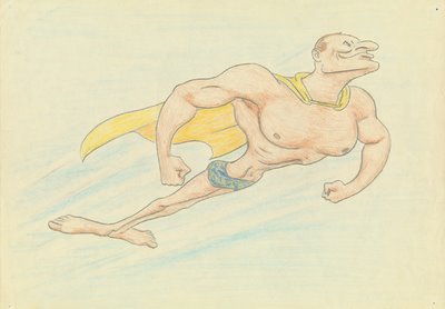
SuperCrump

In his youth, Roland Crump, whom we talked about in our post on Friday, was a serious muscleman and fitness buff ... Thus, this rendition by John Sparey of "SuperCrump". SuperCrump Another in our series of artwork by John Sparey. Click here to read entire post

Saturday, September 23, 2006

Non-Heroic Animation Box Office

Not a stellar week for animated features at the box office. "Everyone's Hero" debuted a week ago Friday to lacklustre results... and the returns are lacklustre still. The flick is nudging against $8 million in total box office after eight days of release. Kevin's estimate of $15-20 million final box office tally will probably hold. On the other hand, the national treasure entitled "Jackass II" appears to be picking up some nice coin... Addendum: "Everyone's Hero" slides 21.6% into fifth place. $4,750,000 for the weekend. Tally-to-date: $11,594,000. "Barnyard," down in the fourteenth position for the second weekend in a row, has now crossed the $70 million threshhold. Click here to read entire post

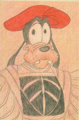
Sparey's Goofy Gallery: Hans Goofbein

Today, we get The Goof in the style of Hans Holbein The Younger (the artistic beats go on...and on)... ... from the collection of John Sparey, more of whose work can be found on our blog.
Holbein worked in the court of Henry VIII, and Goofy is © Walt Disney Pictures. Coincidence?
Click here to read entire post

The Claude Coats Interview -- Part Deux

More from Mr. Coats as we dive into the second half of my 1978 talk with him... SH: What I'm trying to do is sort out the early conceptual stuff on "Pinocchio" and who did what. Also how you arrived at a certain look, and what the look was based on. Tenggren's stuff? Story books? CC: Actually, there was a sort of strangeness about the character of "Pinocchio," really. It seems to me its more Bavarian or Swiss, and yet the name is Pinocchio and it sounds Italian. But I'm not familiar enough with the original pen-and-ink drawings to know what style they had. So there was no basis for the picture, except for Tenggren's stuff. Albert Hurter was the one who really started off on "Snow White," with carving things in there, and the backs of chairs, and little animals. And his drawings were what were incorporated into "Snow White." During the period before "Pinocchio" he did an awful lot of little jugs that had funny faces on them, and handles and funny feet, and all kinds of ways of humanizing inanimate objects. He did an awful lot of styling on the clocks and the music boxes and all the little things that came in and out. Just the general character of things. Probably the style of the architecture of the carving on the little stand that Cleo's fish blowl was standing on. Hurter was an idea man, story sketch and ideas. He'd try and spark Walt toward a certain trend, or whatever. "Snow White" provided a lot of good experience, and even before "Snow White," the multiplane..."The Old Mill" was kind of a good one for techniques and for the fact that the sceneics were very strongly stressed, in that one particularly. Probably more so in proprotion to animation than ever before. And I think it kind of opened the door for some scenes to be appreciated for just their scenic value, especially through "Snow White," and that same idea went into "Pinocchio" too. The feeling of just establishing scenes that gave it atmosphere. Some of the styling in it was done with Dick Kelsey; he did Pleasure Island. I did some of it, Ed Starr did some of it. I think early on I was sort of doing a background version of Tenggren's drawings that might not apply any longer...so I'd be drawing certain color elements out of it and putting it into a form that fit the layout. There's one in the hallway now with the violin that Dick Hennessy drew and I painted. There are a couple in there that look kind of funny because there's big shadows in them. In a street scene, with Gideon and Foulfellow in it and righ now it's almost faded out, but at the time a density cell that was a black matte that we gave a partial exposure to give a light and shadow effect to the scene. And that could never be put on the wall because the black shadow was only a partial exposure to get more believability into it. One of the things that Walt was really great on was curiosity. There were so many things he was interested in...even the early parts of model making for the park. One time in Paris, he found a milliner's shop that had all kinds of little tiny flowers, and all kinds of little things that were used in model-making that could be adapted in some way, so he came back with a whole bunch of stuff and then we didn't know where to send for more of it, you know. Of course a lot of people sent you things. I remember we had a little model room during "Lady and the Tramp." And we started oing some models there to see if they would help us in layout work. There were things like stoves that might have been used in the kitchen, models of woodburning stoves. And somebody had sent tables and chairs and mitiature sets. On "Pinocchio," Tenggren's styling was kind of like a background. He did the stuff down by the watefront, the coachmen and Gideon and Foulfellow. There was another good drawing he did of Pinocchio walking the ocean floor with a stone tied to his tail, with a ship in the background. The ship was later eliminated, but the flavor of his styling of that scene was carried on and kept through the underwater sequence. That was the kind of thing that Tenggren did. Gustaf T. And I think some of the character model sheets were Tenggren's. They had the character of some of the little swiss-looking village, but they had a very interesting proportion to them. In fact, I think they influenced the scale of Disneyland a lot, especially the early things in Fantasyland, regarding scale. Tenggren was at the studio two or three years. He must have come at the very end of "Snow White," and he helped style the hunter that Ham Luske was animating. He had that nice, crisp pen-and-ink style, but we found the ink lines kind of jittered when you were panning. I remember we softened the lines down, even on "Pinocchio." The character was moving along so fast with the lines, that he seemed to be tied to the paper. The ink lines just seemed to cling to the paper. Somehow they didn't seem to have any space behind them. Now, you don't seem to have that problem with Xerox, and I'm not sure why. Maybe the Xerox lines are a little softer. SH: I should run along, let you get back to work. Do you have any other pearls of wisdom you can drop? CC: Especially not pearls. SH: Turquoise, maybe? How did you come out here to the studio? CC: Phile Dyke looked at my portfolio. He was a watercolor artist who exhibited a lot, and I'd run into him and he remembered some of the watercolors I exhibited around. Somebody who knew him mentioned my name, and I got an appointment to see him. I did another bunch of samples for him. He suggested I try doing two or three different things. I did something about a fire. When I first got to Disney's on Hyperion, I was in the building that is now the wardrobe building out in the back here. SH: Did you think then that you'd be with the organization so many years later? CC: I could never really imagine any other place to work. I've been here...thirty-three years. SH: Well, keep it up and maybe they'll take you on permanent. CC: Yeah. That's what I've been hoping. Click here to read entire post

Friday, September 22, 2006

Stages of Crump

Roland Crump started as an inbetweener at Disney in 1952, in the same wave of artists as John Sparey and most of the other artists in our series of John's artwork ... I met Roland for the first and only time at WED in 1981, where the Disney animation department enjoyed a presentation by -- and long lunch with -- the WED Imagineers. "Rollie" was the most vivid personality in attendance. I sat next to him for two hours and he regaled me with tales about his last Disney animation gig: keeping track of ALL the spots on ALL the dogs in "101 Dalmations," making sure none of them slipped or changed position. Roland said the job drove him bonkers, and he was grateful when Walt happened into his room during a nighttime prowl, spied Mr. Crump's array of small, spinning mobiles, and dispatched him to WED in Glendale. Roland spent the rest of his Disney career working on designs for the Haunted Mansion, the Enchanted Tiki Room and It's a Small World. Mr. Crump was also known for a series of "psychedelic" posters satirizing the political and social excesses of the era.

John drew this cycle after noting the transitory nature of Crump's facial and hair grooming:

CRUMP 1

CRUMP 2

CRUMP 3

CRUMP 4

CRUMP 1
Click here to read entire post

The Claude Coats Interview - Part One

Claude Coats was a Disney background artist -- and later WED imagineer -- who was with the company for half a century. Claude and my father were good friends, and I have vivid childhood memories of swimming in the pool at Claude and wife Evy's rambling Burbank house, of watching the elaborate narrative home movies that Claude made with his kids (they were adventure films, often with a comedic twist) and generally hanging out. I talked to Claude about his background work at Disney's in April, 1978 for a "Pinocchio" article on which I was working. Here's the first half of what transpired: CC: Gustaf Tenggren did a lot of work on "Pinocchio." He was really kind of a fairy-tale book illustrator, and a very capable guy. He had that nice style. In fact, I think I worked with him just before "Pinocchio" on "Little Hiawatha." He did some drawings on that and I did backgrounds for it. We kind of worked along with him, and we tried to get a kind of pen-and-ink style on that. It was a little bit the forerunner of the style of "Pinocchio." Tenggren's tyle was really pen-and-ink and wash. But it turned out that pen-and-ink at that time didn't feel quite right. Now we're into it with the Xerox process, but that that time it felt like it didn't have any depth to it. It had that line kind of hanging around everything. Of course, we accept it now. But Tenggren got into the style of architecture in the buildings. He was following right after "Snow White" where it had a little of the carved work, so this was a litte more colorful and a little more like the painted villages and the Bavarian architecture of a fairy-tale land. I think Gufstaf left before "Pinocchio" was finished. He didn't really get into the backgrounds at all. He was mostly involved in the early style of the picture. In background, we'd take Tenggren's reasonable ideas or concepts for a scene. The layout people had already used them in doing their work, and we'd look for coloring and ideas of deccration. He was very definitely a strong influence. Some of the buildings, like he had a beautiful little theatre building actually, a puppet theatre, but because the story got changed the theatre became a wagon, which helped the story out ar fast getting rid of Stomboli when we needed to. But the puppet theatre got dropped. Tenggren's original drawings were very good. And I think he had a lot to do with styling the figures. Some of the Stromboli drawings. There's one of those in the downstairs hall. SH: And I notice down there that the fox and Gideon in thos sketches look pretty much the way they do in the film, but Pinocchio looks a lot different. More puppety. CC: Yeah, thinner, wasn't he? A little stringier. SH: Then he became more boy-like. CC: Yeah. SH: Eric Larson was thinking you were the lead man in color on "Pinocchio." CC: Yeah, I sort of...we were over in those old boxcars that just got torn down over there...over on Hyperion. All that was on Hyperion. We'd just moved into the new studio when"Pinocchio" was released. I remember being in a meeting about Jimmy Fiedler who was a radio reviewer. And he used to comment on pictures and give them two, three or four star ratings. And he'd given "Snow White" four stars. I remember Walt had a lot of people in 3E 12, listening to Jimmy Fiedler, and Fiedler gave "Pinocchio" three stars and Walt said some kind of thing like 'goddamnit." SH: I read TIME Magaine's review and they said "Well, it's gorgeous, but it's not 'Snow White.'" CC: Yeah. But it some ways it had a lot of fantasy of its own. That was probably the most complicated inking we ever did. I remember Evy -- my wife, she was in ink-nad-paint then -- inking 22 ink lines on Jimimy Cricket. And later on, when they were doing those TV shows, it was just obvious we couldn't have that many colors. And it got down to where even then it was six or seven. Of course, now with the Xerox, maybe one color change around the face would be about it. SH: When did you come to the studio? CC: I came in 1935. I really only wanted to be a background guy. Pyil Dyke was at the studio then, and I think Walt was trying to get a renewal of talent. The early cartoons were kind of flat and the backgrounds an outgrowth of cel work. You know at first the backround and cels all looked like one, and then the backgrounds got a few tints in them, but they always were definitely cartoons. And I think Walt was always striving for "what do we do next to make these better?" and to get more reality and depth and believable light into them. And because of that, the characters' looks got more complicated. The dwarfs had roundness, and some shadows under the jowls to give them some dimension. There was an endeavor with the whole of animation. Alan Graint, who taught at Choinard, was very good at instructing a lot of animators into how to get more form into their drawin, more roundness and character. On "Pinocchio," when there were story meetings on what the sequences would look like, and Walt would have seen the story sketches, of course, and they'd have an indication of what the style might be. And the early styling drawings and a little later on Mary Blair got into that, and sent us early drawings during the story period. Mary Blair worked here with her husband (Lee) through Pinocchio", and they went down to South America with Walt. Then the war came along and Lee went into the navy, and when he got out he opened a studio in New York, an animation studio, and Mary was with him. But Mary used to send in styling ideas. But I don't believe she was on "Pinocchio" a lot. She did some work on Disneyland and Disney World. You usually worked with the layout man and the director. They were the guys you answered to. More so than Walt, I think, as far as that goes. Walt talked to them more than us. We'd have meetings with him. We'd usually do photographs of the very first scenes, backgrounds would be done, first animation, test scenes would be done. It'd finally be inked and painted, and there'd be a big meeting when the color came back and we'd look at what the first scenes looked like. And I can never remember Walt being too surprised at what they looked like. Click here to read entire post

Thursday, September 21, 2006

The Mid-Week Studio Roundabout

At Universal, the "Land Before Time" franchise has blossomed from sequel #13 to 26 half-hour episodes of a "LBT" series now in full-bore production. It's scheduled to air on the Cartoon Network next Spring, and the crew has hopes a second-order isn't far behind. (The producer said the first two episodes, back from overseas studios, look remarkably good.)... The other news at the Big U is that "Curious George" has been picked up for a second season by PBS. Over at DreamWorks, "Flushed Away," is complete, and a few staffers work on "FA" commercials and interstitials. (In case you missed the press release, Rob Minkoff -- co-director of "The Lion King," director of the Stuart Littles I & II, also "Haunted Mansion" -- will be developing and directing a feature-length adventure of Mr. Peabody and his boy Sherman...) Click here to read entire post

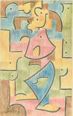
Sparey's Goofy Gallery: Gleef

This one will take a few moments of your time ... Goofy, Paul Klee style, by John Sparey

Can you find Goofy in John Sparey's tribute to Paul Klee?

There's more Sparey on our blog.

Whatever you see is © Walt Disney Pictures. (And don't you ever forget it.)
Click here to read entire post

Wednesday, September 20, 2006

At Nickelodeon

I took a quick trip through Nick the start of the week; studio has a couple fewer series going than it usually does, but that should change.... A studio exec told me that the studio is looking to start 2-3 new series in the next few months. (They're waiting for the proverbial "green light.") This is a good thing, since probably several of their older series are coming to the end of their active lives. (By "active" I mean like, producing new episodes. The toons will obviously be earning coin for Viacom for decades to come.) Series still in work include the ever-popular "Sponge Bob Square Pants" (20 episodes in work), "Avatar" (20 episodes), "Diego" (20 episodes), "Mi Hao Kai Lan" (20 episodes), "El Tigre" (13 episodes), "Tak" (13 episodes), and Nick's program of new shorts, which is called "Random Cartoons" (13 newbies there). Click here to read entire post

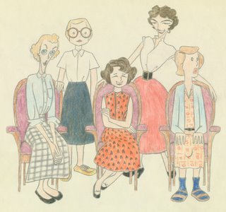
A portrait of five women

Here's John Sparey's portrait, from 1954 or 1955, of five women who worked at Disney, four of whom who would have been among the first to break the gender barrier to get artistic jobs at the House of Mouse. Until not long before this, women artists were only considered for ink-and-paint or other non-artistic jobs. Nancy Stapp, Rith Kissane, Janie McIntosh, Lyn Kroeger and Eva Schneider
  • Nancy Stapp (front left), the daughter of industry vet Terrell Stapp, attended Chouinard and Occidental before starting at Disney as an inbetweener in 1954. She seems to have been let go in the "Black Friday" mass layoff at the end of Sleeping Beauty, after which she enrolled at USC and left the industry.
  • Ruth Kissane (left rear), "one of the top women animators of the modern age" (Jeff Lenburg), went on from Disney to design the layouts for most of the classic Bill Melendez Peanuts specials and features. She directed Captain Kangaroo spots for John Sutherland and animated for John Hubley on Everybody Rides The Carousel and The Doonesbury Special. After her death in 1990, she received ASIFA-Hollywood's Winsor McCay Award.
  • Janie McIntosh (center) was the secretary to animation administrator Andy Engman.
  • Lyn Kroeger (right rear), who appeared as Snow White in this John Sparey pastel, left Disney in 1955. Our files show a long list of studios for which she inbetweened or assisted: Quartet, Melendez, Murakami/Wolf, Haboush, Levitow-Hansen, Duck Soup and Hanna-Barbera, until 1984, when she left the industry.
  • We previously profiled Eva Schneider (right front), who appeared in this picture from our John Sparey collection. In case you missed Floyd Norman's comment on that post, after she left animation in 1981 she moved to New Orleans where she lives to this day. She refused to evacuate after Katrina, and Floyd says there was a picture of her and her dog in Vanity Fair a few months ago.

Here's more of the art of John Sparey.

Click here to read entire post

Roy Brewer, 1909-2006

Roy Brewer, a major force in the history of Hollywood labor, died on September 16 ...
Left: Roy Brewer at the White House with President Ronald Reagan.

Roy M. Brewer, a Hollywood labor chief in the 1940s and ’50s, whose leadership and outspoken anti-Communism during one of the most violent strikes in American history catalyzed Ronald Reagan into political action, has died in Los Angeles, aged 97. He passed away on Saturday, and the cause was complications from pneumonia, according to Brewer’s daughter, Ramona Moloski. Although Brewer never ran a movie studio or directed a picture, for about a decade he had as much sway in the film capital as any mogul or filmmaker. He came from humble origins in Nebraska, and traveled to walk the corridors of power, becoming a confidant and close ally with such figures as Cecil B. de Mille, John Wayne, Clark Gable and Walt Disney ...

Brewer was close friends with SAG union activist Ronald Reagan, and is credited with Reagan's 180-degree political shift to the right. Brewer was the unofficial commissar of the Hollywood blacklist. He was head of the West Coast office of the IATSE, a rival union to the Conference of Studio Unions (CSU) when it was allied with the Screen Cartoonists Guild.

After the CSU's defeat in the late 1940s, Brewer worked to form IATSE Local 839. Tom Sito quotes him at an open debate meeting, screaming "You are pathologically unfit to work in this industry!" at SCG activist Bill Melendez. Local 839 won NLRB elections at virtually all of the major studios, and was chartered in January 1952.

A couple of years later, Brewer's star in the IA declined somewhat after he lost an election for IATSE president against incumbent Richard Walsh. Brewer remained active in the IA as something of a gadfly; we can recall seeing him in the 1980s, getting booed as he made speeches from the floor of IA conventions.

There will be much more about Roy Brewer and his times in president emeritus Tom Sito's book, Drawing The Line, to be published next month.

Click here to read entire post

Tuesday, September 19, 2006

Ken Anderson SPEAKS

Above: Ken Anderson in 1977 with Elliot the dragon -- shortly before I worked with him on "Catfish Bend." Ken Anderson -- a pillar at Disney Animation for forty-plus years -- worked in animation in the thirties, then layout in the forties and fifties, and finally in story. He talked to me for an article back in May, 1978, around the time he retired from the studio. I share the pearls of his insights below... KEN: I think that Walt was always impatient with the restrictions of a cartoon. He strived for more and more realism, more naturalism in the features. In "Pinocchio," in those big downshots of the town at the beginning of the feature, Charles Phillippi -- the head of layout -- wanted an eagle's eye view of the town's streets. That downshot was six feet wide and six feet long. What Walt wanted in his layout people was a group of guys who would be capable of previsualizing the animation in the scene before the animator got them. So he wanted to have men who could draw the animated charaters. Charlie Phillippi and Hugh couldn't draw characters, but they were brilliant in staging and brilliant in camera moves. But that gave them a weakness as far as Walt was concerned. I came out of animation and could draw characters. I practically keyed several dwarf scenes in "Snow White," like where Grumpy's nose is coming up over the top of the bed. I did some of this in "Pinocchio," but by then I was tapering off. Several scenes that I keyed -- and almost pose-tested the animation -- the animators just timed out and completed. Guys like Fred Spencer were getting bonuses for stuff I keyed. But Walt made it clear to me that posing wasn't what he wanted me to be doing, and my interest shifted from character keying to layout and design to character development and then to story. All those things are tied together, particularly character development and story, because they go hand in hand with making a good picture. And all those things have to be synthesized -- story, color, music, characters -- to make an entertaining whole. Walt allowed you to draw your own inferences about what you were to do, but he let you know when you wandered away from what he wanted. So instead of keying, I began working on persepctive. I'd make a grid of how big or small a character would be in different parts of the layout, so the animators would have a reference whenever they moved the character around on it. To me, the perfect culmination of layout, animation, and art direction happened in "Song of the South." Every scene was thumb-nailed before it went to layout, checked with the director Wilfred Jackson and story man Bill Peet. Then the scene was cast for an animator and the animator could redraw the thumbnails if he wanted and we would thrash it out. So we knew exactly what a scene was going to look like before the scene was photographed, before the live actors were shot. And we could go into a sweat box and know if a scene was right or not. There were plenty of arguments, it was never easy, but I think we got a better result. We pasted all the thumbnails in a large book so we knew exactly where we were at any given time. There was never that degree of coordination again. Jackson had a heart attack and was in and out, and other things happened. On "Pinocchio," Gustaf Tenngren had the greatest influence as far as creative input. I had a lot to do with every sequence except the whale. I built the model of Stomboli's wagon, put in the springs so the action was right, and so on. We painted the wagon flat and outlined all the differed colored sections of it with a thin black line, and then we photographed it and transferred the image to washoff cells, which were photographically sensitized cells, and then they'd be painted. We had a problem with the cells shrinking at different rates, so that there was a jiggling effect to overcome. There were a lot of problems, but the basic system was diveloped for "Pinocchio," and we've used it ever since. One of the most difficult scenes in terms of layout was where Pinocchio is in the bird cage in Strombolli's wagon. It was a multiplaine shot, and you had a great number of levels. There was the swinging bars of the cage -- two levels, front and back -- and Pinocchio inside the cage, responding to the pull of gravity. The problems with registration were tremendous. On top of that, there was the light coming in through the window, with the moon shining in the background. That was on the level farthest back. The moon was held while other things were moving and swinging. The light ray of the good fairy had to be air-brushed. Planning all the effects was every complicated and involved a lot of planning. I doubt that the care and expense that went into that feature could be duplicated today. What interested Walt was our striving for new things. I kept a notebook of camera angles and moves from other pictures, for instant "Anthony Adverse" (WB 1936) where the hero and heroine kiss and the camera moves up into the trees and whirls around as if the girl was swooning, then comes back down. Walt took a look at the notebook and liked it, and had the others start to keep ones like it. Walt was always aiming at exceeding the limitation of the medium, but we never heard it expressed in so many words. Click here to read entire post
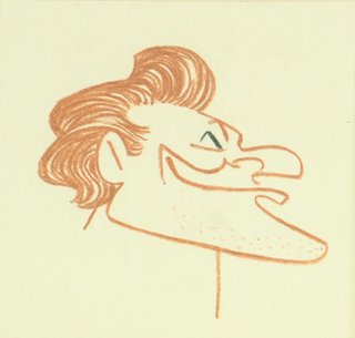
Sparey's Goofy Gallery: El Gufco

John Sparey envisions Goofy as he might have been painted by Dominikos Theotokópoulos, also known as ... El Gufco, by John Sparey

... El Greco.

Another in our series of John Sparey's work.

We like to think that Goofy belongs to all of us. But he's still © Walt Disney Pictures.
Click here to read entire post

Monday, September 18, 2006

Monday Disney Walk Through

It was kind of the usual, walking around Disney Feature Animation's hat building this morning. I went from room to room handing out my yellow flyers for TAG's panel of financial advisors who will dispense wisdom about saving for retirement and a rainy day at our end-of month membership meeting... To demonstrate what an action-packed day the Mouse House was having: The biggest news is the espresso/frappuccino/coffee stand that has become a fixture at the front entrance of the hat building is getting moved from its exterior location to the middle of the second floor (the area next to the stairwell is torn up and draped with a big, white plastic sheet). Some are happy with the new location, others are sad it will be leaving the sunshine and ozone of Burbank's great outdoors. "Meet the Robinsons" continues to zip along, and all the finalers Disney needed to push the feature through to completion are now hired and working energetically on the first floor. As a production person said to me: "We got a little hard-up for room. A few of them are crammed in to some tight spaces." Up on the third floor, story development continues on "Frog Princess," "Joe Jump," "American Dog," and "Rapunzel." On the second, some artists and tech directors attached to these shows lead low-key lives, waiting for production to work on. TSL Negotiations: I keep getting asked about contract negotiations by Disney employees. (The TSL agreement covers many artists and technicians working on CGI features.) Talks were originally scheduled for last Spring, then got moved back to June, then to September. Now it looks like it's going to be October when labor and management sit down to hammer something out. Disney Labor Relations say they'll let TAG and the IATSE know specifics dates "any day." When the magic moment arrives, I'll let people know. Click here to read entire post

Wes and Eva at the gallery

Wes Herschensohn and Eva Schneider seem to have different perspectives on classical vs. modern art ... Wes and Eva were both at Disney at the time that John Sparey would have done this pastel (mid-1950s). Among those in the portrait gallery are Gary Mooney (left) and Bob Carr (in the American Gothic). Wes Herschensohn seems to have been the subject of many of John's drawings and pastels, two of which we have posted here and here. He went on to a career at such studios as Eagle, Format, DeTiege and Hanna-Barbera, ending up as a layout artist at Filmation where he was working when he passed away in 1985. (Wes's brother Bruce you might have heard of. He came close to becoming a U.S. Senator from California in 1992, ultimately losing to Barbara Boxer in the finals.) Eva Schneider was a breakdown artist who eventually made it to assistant at the Mouse House. She was at Filmation almost from the beginning, going back and forth from background work to assisting, until she left in 1981. We've lost track of her after that ... anyone have an idea what happened to her? Here's a list of our posts of John Sparey's work. Click here to read entire post

Dennis Venizelos at the TAG Computer Lab for a Photoshop demo

Tonight at 7 PM Dennis Venizelos of Gang of Seven Animation will be giving a Photoshop lecture and demo at our Computer Lab... Dennis is a vet of the 2-D animation biz and will talk about how he made the transition from traditional to digital production. He'll also demonstrate his painterly style, and talk about his work as background department head on The Iron Giant and his current work at G7. The lab is located at 4729 Lankershim Blvd in North Hollywood. Please RSVP to lab@animationguild.org or call (818) 766-7151 and speak to Trell. Click here to read entire post

Sunday, September 17, 2006

Sparey's Goofy Gallery: Modgufliani

On a lazy Sunday afternoon, John Sparey imagines the Goof in the style of Modigliani ... Go here for an index of our posts of John Sparey's art. We'll be featuring lots of John's art here over the next few weeks. And who IS John Sparey? One of the long-time pillars of the animation industry, that's who. John started at Disney in the early fifties. (For decades, it was almost an axiom that everyone started at Disney.) John worked at a wide variety of studios over a career of 40-plus years as an in-betweener, assistant, animator, sequence director and director. John retired from Film Roman in the mid-nineties.
We've said it before and we'll say it again -- Goofy is © Walt Disney Pictures
Click here to read entire post

Saturday, September 16, 2006

Where the Jobs Are...and Aren't

Let's look at work in America and Animation. First, a look at the BIG picture... And here are where the jobs haven't been created: In our little corner of the world, animation has been on its usual roller-coaster ride. Both short-term... and long-term... While overall employment levels in animation have risen over time, technology has been the driver these past half-dozen years; lots of animation artists without the right skill sets have been left on the side of the road. The part of the equation that isn't shown in the animation charts is, there are a lot of jobs in the non-union animation sector. (Specifically, games, visual effects, indie features, internet and broadcast animation/graphic arts.) While many production jobs -- particularly in television -- have moved off-shore, some work has come back. Beyond the cold statistics, anecdotal evidence suggests that many (not all) artists with experience are finding work. That work is now of shorter duration than ten years ago, but it IS out there. The other difference: wages were way up in the middle nineties -- particularly in feature animation but also in television. In retrospect, what we had was a one-time phenomonenon: a whole lot of jobs at Disney, DreamWorks, Warner Bros, Turner, and Fox chasing a limited number of qualified people...and salaries skyrocketed. This wasn't sustainable, and sure enough, over the next six years weekly paychecks fell back to earth. We are now, I think, in a more even-keeled mode, but jobs are always going to be pushed and pulled by outside events beyond our control. It's best not to take anything for granted. Too many artist in 1995 thought the gravy train would roll on forever. Turns out they were overly optimistic. Click here to read entire post

Not quite Everyone's Hero

This weekend marks the release of the 9th (or is it the 10th?) CG feature of the year, Everyone's Hero, from IDT. The Friday numbers don't look so great... ...with Screwy the baseball and his pals in 4th place with about a million and a half. That looks like an opening weekend of probably around $5 million, and projects out to a domestic theatrical run of $15-20 million. IDT was recently bought by Liberty Media and turned into Starz Animation, and has the films Space Chimps and Sheepish scheduled for 2007 and 2008, respectively. We'll update this post as the weekend progresses... UPDATE: The weekend estimates are in, and Everyone's Hero climbed to third place and $6,150,000. Unfortunately, the per-screen average was the weakest of the four films opening this weekend, and this isn't looking like a case of a film that will develop "legs." Speaking of good legs, Barnyard was 14th this weekend ($69.1 million) and will probably pass Monster House ($71.4 million) before long, despite a significantly smaller opening weekend ($15.8 million vs. $22.2 million). Click here to read entire post

Friday, September 15, 2006

Unpaid Wages

There's more of it going around than you might imagine. (I deal with it quite a bit.) But the left-wingers sitting on the California Supreme Court have pointed to a remedy: EMPLOYERS! PAY UP!... On July 10, the California Supreme Court ruled that employers must promptly pay employees for work done on a limited duration project, such as a film or television production. Section 201 of the Labor Code requires than an employer immediately pay workers their wages if they are discharged. Until the case of Amanza Smith v. L’Oreal USA, Inc., it was not clear that these rules — and the penalties for failure to pay in a timely fashion — applied to employers working on a project of limited duration and not just individuals who were fired. In the ruling, the California Supreme Court concluded that the intent of the statutes was to protect workers from the economic hardship that unpaid wages caused. The decision stated that the law applies whether an employee is fired or released after completing a specific job of limited duration. The ruling reversed a previous decision by an appeals court in favor of the employer. These rules apply to all employers in the State of California, union or non-union. The above is good for all of us to know, yes? Click here to read entire post

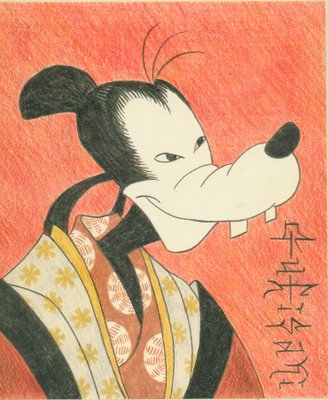
Sparey's Goofy Gallery: Gufisaki

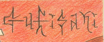
Gufisaki, by John Sparey Today's entry from John Sparey's Goofy History of Art carries its title in its signature ... ... and all you have to do is turn it 90° counterclockwise: Go here for an index of our posts of John Sparey art.
Far be it from us to deny that Goofy is © Walt Disney Pictures
Click here to read entire post
Site Meter