
Why did the Animation Guild decide to get a new logo?
Over the past years, your guild has been pursuing efforts to modernize. These steps have included our new building, a redesigned, more easily navigable website, and an updated computer lab with Cintiqs and current software. All of these steps help us improve the services we provide to our members.
Updating our brand identity is part of these efforts. We deal with billion dollar multi-national corporations that need to take us seriously, both as talented individuals and as a whole through our union. These companies are slick, smart, and known throughout the world. We need to stand toe-to-toe with them and win. It's time for our visual identity to reflect that need.
It's time for the Animation Guild to have a logo that's instantly identifiable, timeless, and strong.
Who designed the logo?
The signature and type were designed by Malcolm Grear Designers in Providence, Rhode Island. We gathered numerous bids from a variety of graphic designers, including local firms here in California. Our Rhode Island School of Design (RISD) alumni may recognize the name; Malcolm has been teaching graphic design at RISD for half a century. This connection spurred board member Karen Carnegie Johnson to contact them for a bid.
What led us to choose them was their portfolio of logo signatures: staggering and impressive, timeless, and all of them relying solely on shape and form, versus reliance on color or fad, with layers of meaning. Deceptively simple, their designs capture and represent integral elements of their clients' core identities in memorable ways.
Their website states that "Any serious organization must seek to distinguish itself and claim the attention of its audience and clientele." This was our goal, and the executive board voted MG Designers as the best talent for the task.
Why didn't the Guild ask one of its members to design the new logo?
We did not hold a contest within the membership for a new logo simply because we've been down that road. Our last contest garnered an apathetic response and we did not seek to repeat the experience.
The fact is that designing a brand identity is a difficult, challenging task. (Especially one for a group of artists.)
As we advocate to the studios that they hire the finest animation professionals they can, our members here in Los Angeles, we sought to procure the most talented group of trained, experienced graphic designers we could.
What was the design process for the logo?
From MG Designers:
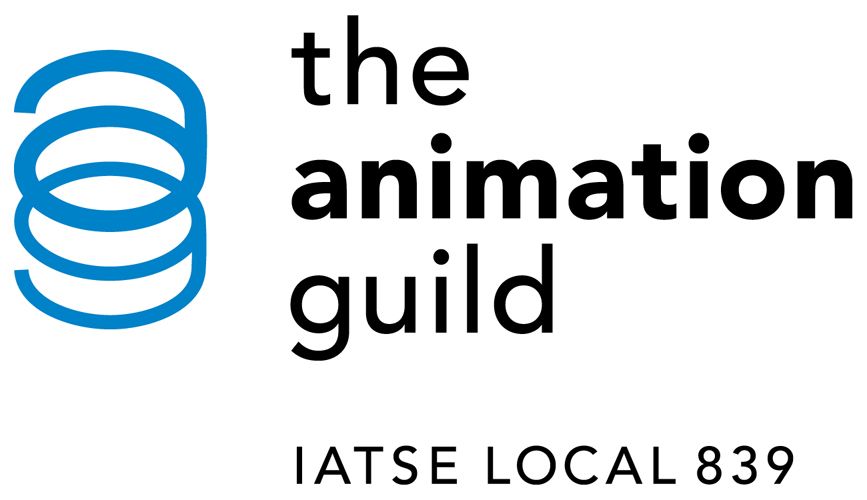
When we at Malcolm Grear Designers began the process of designing the new symbol for the Guild we went through many, many visual studies before arriving at the one that we felt was unique, active, alive, and thus memorable.
Since the Guild is made up of a diverse group of creative artists, writers and technicians in motion-picture and television animation and computer graphics it was important to us that the symbol not represent any specific design style.
As the lowercase “a” and “g” join together to form the symbol, the letters seem to be in constant movement, animated. They appear linked and interwoven but they also actively flip back and forth, each letter switching from foreground to background.
There is also a cylindrical depth and dimension to the symbol, allowing the eye to travel through the form. The varied line weights help generate this sense of volume and activity.
The letters are dependent on each other to form the whole, a “union” so to speak.
What happens now?
Come by our booth at CTNExpo this weekend and and "meet" the new logo! We'll be using it on our website, emails, and throughout the Guild going forward. Our stationary and business cards will switch over once we've used the existing inventory. We'll have some give-aways at membership meetings and at the CTNExpo. We also have a fun gift in the works which we'll give out at the holiday party.
Lastly, the logo is a symbol to represent us as a cohesive whole. You, our members, remain the pillars and purpose of the Animation Guild. As we saw this past summer with our negotiations, if we want the studios to view us as solid and strong, we must first embody and project that strength and unity. A new visual identity is but one aspect of this, but it is an important one.
Thanks, and hope to see you at one of our events!
-- Karen Carnegie Johnson


7 comments:
I have no qualms with this logo and I hope it stays.
Nice logo.
For a spring factory.
What does the spring represent?
Youth. Vitality. Creativity.
Shouldn't the text for'the animation guild' be in the same font as the 'ag'?? The difference is jarring and unprofessional.
I think the spring shape symbolizes movement from letters - which is exactly what we do. It includes both our animation writers and artists.
At first, I thought this new logo was for AT&T.
Post a Comment