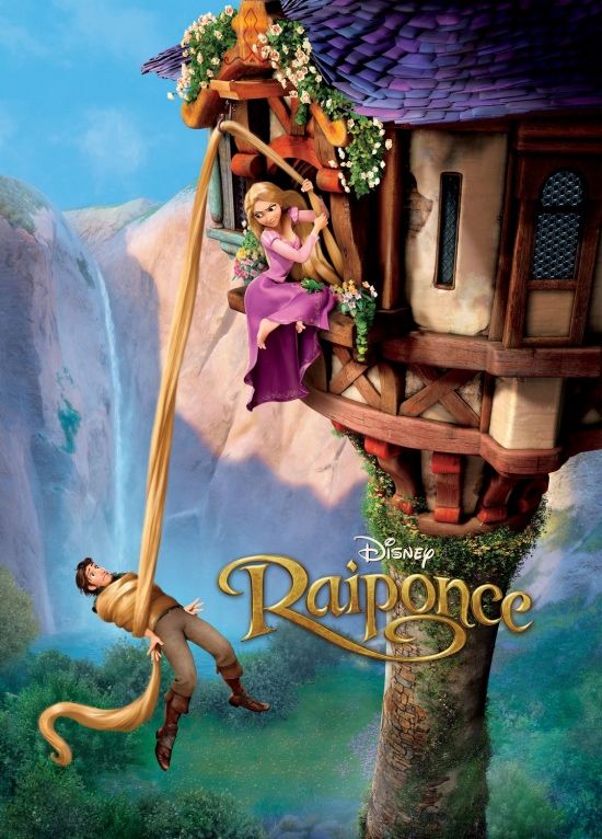
Diz Co. has unveiled new theater art ...
... and as charming as it is, it doesn't begin to do justice to the visuals I've seen in and around the hat building.

Diz Co. has unveiled new theater art ...
... and as charming as it is, it doesn't begin to do justice to the visuals I've seen in and around the hat building.
The thoughts and observations of the leaders of The Animation Guild (TAG), Local 839 IATSE. Jason MacLeod is the Business Representative, KC Johnson is the President. Mike Sauer is Assistant to the Business Representative.
This weblog reflects their individual personal opinions and does not necessarily represent the official position of the Animation Guild.
This blog is updated weekly. If the most recent posts have not appeared, hit the Refresh button.
Let us know if you're an Animation Guild member with a blog
24 comments:
Wow, so the French translation of "Tangled" is "Raiponce" ? How interesting. That almost sounds like ... DOH !
And we make lame jokes about them being cowardly and surrendering...Who was brave enough to keep the original title?
Weirdly enough, if you put a space between the p and the o you get...
Raip once
Gives the picture a whole new meaning. (shiver)
You should see the dutch poster! Especially the title on it. Shock horror, it's called "Rapunzel" over here! Booyah!
Sorry, I can't take my eyes off the fact that they have the waterfall falling almost directinly into the guy's face - bad art direction.
Huh... The film is called "Rapunzel" in a part of the world that the fairy tale originated from. How odd...
From this poster, and every thing else I've seen so far, this looks like another movie where the man is a dunce, inept, and inferior to the , competent, aggressive, heroic woman.
I'm all for heroic women, and goodness knows it's about time-but this seems to be the new cartoon stereotype.
I don't usually buy into 'hidden messages', but I do wonder about that tower and waterfall.
It looks like there was more than just one meeting to make sure that her pose didn't allow him to see under her skirt. The poster looks really awkward.
Obviously from the composition, the man represents Hitler and his political run to power in the mid 30's. The girl symbolizes the mixure of youth gone bad. From the 50's rock rebellion, the 60's drug craze and the 70's sexual looseness. One can only shutter how this graphic image, this blantant visual attack on our senses can and will effect our newly born innocents for decades to come.
HOW Darrrrrrreeeeee you Disney !
other than that, it looks pretty :-)
Actually, the fairytale originated in germany, not in the Netherlands. When I say dutch, I don't mean deutsch. Dutch is the language we speak in Holland/The Netherlands. A lot of people mistake dutch for deutsch, which is german...
aaanyway
looks like bondage to me
What I meant was that it's a European fairy tale, making it (presumably) more familiar to residents of that part of the globe than to Americans. Hence, it makes sense to call it "Rapunzel" in that part of the world, since the fairy tale originated there.
I looked at the poster and I had to go to the bathroom.
The poster who's whining about Bush again is beyond the reach of therapy now. Injecting politics into a cartoon movie poster. What is more pathetic than that?
I think he was kidding
hmpf.... not as good as Astro Boy.
*runs and hides*
Your administrator has removed one of the political comments above, deeming if "off topic."
I mean, there's plenty around here that is off topic, but occasionally it wanders beyond that, and I find it tedious, even in jest.
"Your administrator has removed"
So YOURE the ONE. You Obushbama- hater...................or Bumashobu-lover.....whatever you may be, we are here to stay and throw of them both into the mix.
Yeah for McCain! He beat out that aryan evangelist. Watch out for that guy, he's gonna surface again somewhere uncomfy-like. Maybe "tap" Sarah and his running mate.
The first thing that stood out to me was how horrible the tiles on the roof looked compared to the rest of the poster.
Yeah. The tiles are weird.
"... and as charming as it is, it doesn't begin to do justice to the visuals I've seen in and around the hat building."
Sure, the visuals are nice, but is the story just as good as the visuals. That's what will keep people coming to see it.
Presuming it doesn't get crushed by Harry Potter. I certainly hope they move the release date.
The movie is great, but dont count on the marketing EVER reflecting that.
The movie is like Beauty and the Beast (well, I think it's better), but it will likely only be marketed like Shrek. Using all the gags in the trailers but leavin out all the heart, drama, and adventure. We'll see. Im hoping for word of mouth to save it. You cant underestimate the stupidity that is Disney marketing.
Post a Comment