
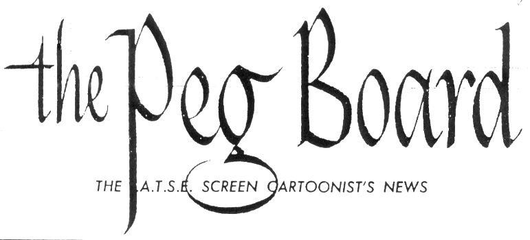
Every good guild or union has a newsletter, and ours -- since 1959 -- has been a monthly called
The Peg-Board ...
It's an out-dated title now, since pegboards, those metal disks in a drawing table to which animators anchor their drawing paper, have almost gone the way of the dodo bird; it's pixels and flat-screen displays now. However, we still use the title, even if the headers have changed. So, we present some
Peg-Board graphics.
In the 1960s, the
Peg-Board header looked like the above. Kind of bland, kind of generic, I think you'll agree. But then ...
... in the nineties, things got more lively. In 1991, we came across this patriotic number by former guild President Tom Yakutis and tacked it to the masthead:
 Thinking we were onto a good thing, we decided to commision a new rectangle of artwork to use as a Peg-Board logo each year. In 1992, background artist Jim Hickey went with the image below (a modified version of the cartoon hand raised in a clenched fist that we occasionally put on picket signs):
 (Remember that we didn't change our name to the Animation Guild until 2002.)
In 1993, President Tom Sito set tongues wagging with this Soviet-style art (a tongue-in-cheek joke which some of our Cold Warriors didn't appreciate):
(Remember that we didn't change our name to the Animation Guild until 2002.)
In 1993, President Tom Sito set tongues wagging with this Soviet-style art (a tongue-in-cheek joke which some of our Cold Warriors didn't appreciate):
 And in 1997, story artist Sergio Aragones (also of MAD Magazine fame) came up with an epic rendering:
 1998 was a time of transition in the animation biz. Artist Raùl Garcia caught the specifics of the change in graphic detail:
 There are more, but we'll display them in another post.

 Every good guild or union has a newsletter, and ours -- since 1959 -- has been a monthly called The Peg-Board ...
It's an out-dated title now, since pegboards, those metal disks in a drawing table to which animators anchor their drawing paper, have almost gone the way of the dodo bird; it's pixels and flat-screen displays now. However, we still use the title, even if the headers have changed. So, we present some Peg-Board graphics.
In the 1960s, the Peg-Board header looked like the above. Kind of bland, kind of generic, I think you'll agree. But then ...
... in the nineties, things got more lively. In 1991, we came across this patriotic number by former guild President Tom Yakutis and tacked it to the masthead:
Every good guild or union has a newsletter, and ours -- since 1959 -- has been a monthly called The Peg-Board ...
It's an out-dated title now, since pegboards, those metal disks in a drawing table to which animators anchor their drawing paper, have almost gone the way of the dodo bird; it's pixels and flat-screen displays now. However, we still use the title, even if the headers have changed. So, we present some Peg-Board graphics.
In the 1960s, the Peg-Board header looked like the above. Kind of bland, kind of generic, I think you'll agree. But then ...
... in the nineties, things got more lively. In 1991, we came across this patriotic number by former guild President Tom Yakutis and tacked it to the masthead:


1 comments:
I think it has class, guys. it has a very skillful and subtle graphic element.
Post a Comment